All art styles
StarVeil Style Library

Y2K Harajuku Punk

Y2K Harajuku Punk

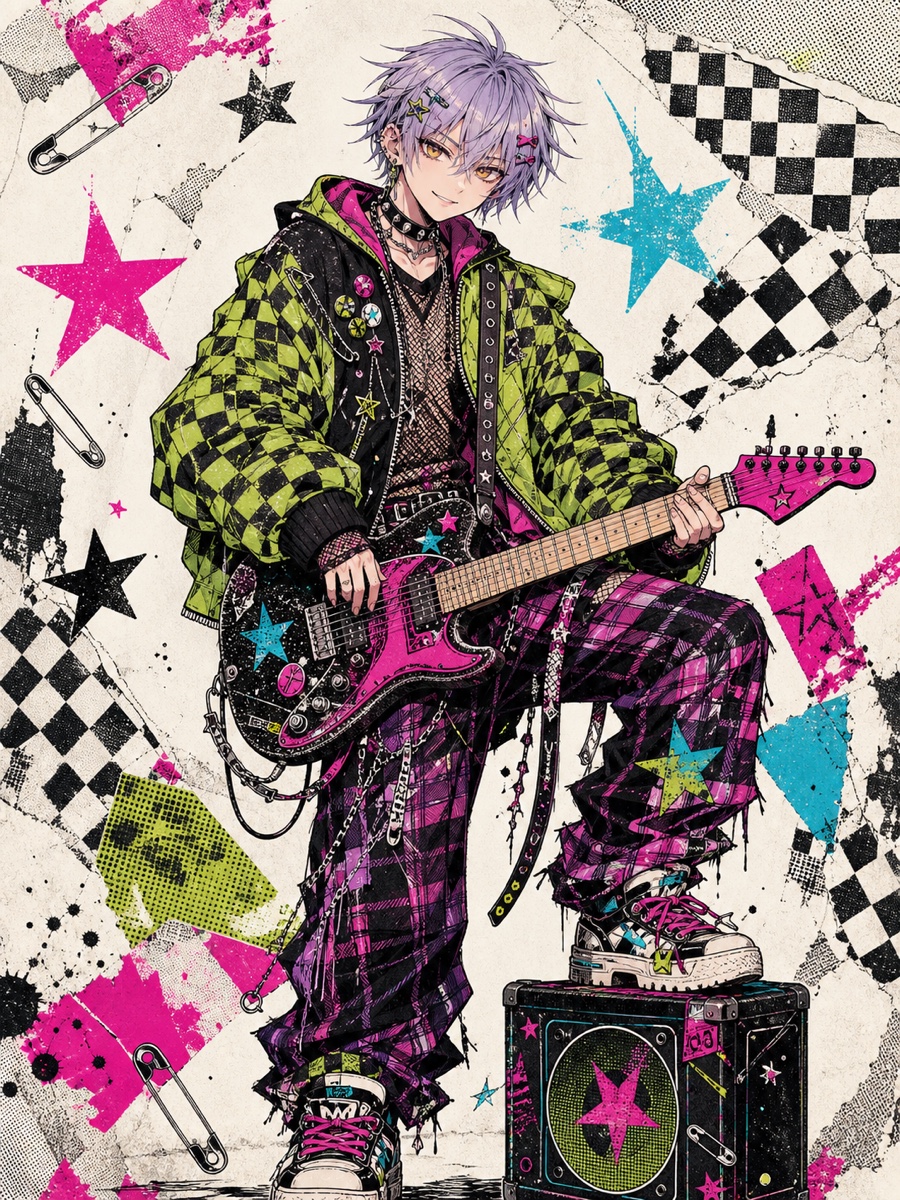
The Y2K Harajuku Punk AI comic style brings Harajuku kawaii-goth attitude into your panels: hot-pink, electric-cyan and acid-yellow collide over a black-and-white base, with distressed risograph texture and misregistered dot screens. It suits rebellious youth, underground band and street fashion stories, giving every beat a zine-like, high-contrast edge.

Y2K Harajuku Punk

What panels look like

Sharp Manga Ink with Distressed Edges

Panels use crisp, varied-weight manga ink that mimics screen-print wear and tear, with high-contrast graphic shapes like hand-cut collage. Heavy outlines emphasize characters and key props, making motion and emotion read instantly.

Fluorescent Spot Color over Dot Screens

A black-and-white foundation is popped with hot-pink, electric-cyan and acid-yellow, sometimes printed with risograph misregistration. Shadows are built from halftone dots and cross-hatched screens, giving everything a rough indie-zine texture.

Hard Edges and Gritty Paper Grain

Light is bold and graphic: hard highlights and solid black shadows create flat, poster-like composition. A layer of coarse grain, aged paper and ink scuff marks makes glowing areas feel slightly imperfect, like a beloved old print.

Expressive Anime Faces over Collage Backdrops

Characters keep expressive anime eyes and exaggerated reactions, styled with gyaru or kawaii-goth hair and accessories. Backgrounds simplify into dot patterns, screen tones and geometric cut-out shapes, keeping the focus on fashion-forward poses and attitude.

Stories it suits

Rebellious Youth and Coming-of-Age

The kawaii-goth attitude fits stories about oddball teens, secret clubs and the urge to break rules. High-contrast inks and neon pops amplify emotional turns—anger, crushes and embarrassment all hit harder.

Underground Bands and Live Shows

The screen-printed energy feels like a gig poster, perfect for band rehearsals, dive-bar performances and chaotic tour life. Fluorescent spot colors make stage lights and amp feedback translate into pure visual electricity.

Street Fashion and Zine Culture

Bold accessories and collage backdrops give every panel a lookbook finish, ideal for stories about designers, thrift-store obsessives or campus style circles. The risograph misregistration and dot screens turn clothing details into part of the punk language.

Less suited to

Less suited to quiet, low-saturation slice-of-life or serious historical stories. The loud palette and print texture can overpower subtle emotion or period atmosphere.

Scene-writing tips

Pose Characters Like Magazine Covers

Write moments where characters tilt their heads, plant hands on hips, or half-hide faces behind accessories. The style turns flat fashion poses into high-impact compositions, so avoid static talking-head panels.

Cut Fast and Use Dot-Screen Transitions

Break scenes into quick beats: a crushed soda can, a graffiti wall, a swinging chain bag. The black-and-white base with neon accents handles this collage-like montage beautifully, making the pacing feel like a handmade zine.

Write Music and Outfits as Visual Cues

Include specific visual details for band or shopping scenes: ripped fishnets, platform boots, guitar stickers, neon earrings. The art will amplify these elements, turning them into shorthand for personality and mood.

FAQ

What is the Y2K Harajuku Punk AI comic style?

It is a Japanese anime-inspired style that blends Harajuku kawaii-goth, gyaru attitude and distressed retro print texture. Panels feature sharp manga ink on a black-and-white base, with hot-pink, electric-cyan and acid-yellow spot colors plus simulated risograph misregistration.

Which stories suit this style?

Rebellious youth, underground bands, street fashion and campus misfit stories work best. The bold palette and collage-like energy amplify emotional conflict and give coming-of-age tales a strong attitude.

Can I keep the same character consistent across panels?

Yes. Each work locks its style, and characters are reused through character cards or reference images across different panels, keeping facial features and outfits consistent.

Will the neon colors make the comic hard to read on a phone?

No. The neon colors are limited spot accents over a black-and-white base, with risograph misregistration used sparingly. This keeps panels readable on phone-sized serialized comics without overwhelming the eye.

Similar styles